

Added March 2021
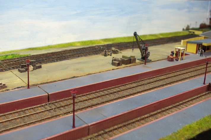
A backscene for Plumpton Green
Plumpton is a rural village in East Sussex, and around the beginning of the 20C was rather more rural than now, with a population of only around 400 souls, and hence not many buildings. Most of the background (the spectators look northwards) is fairly low-lying farmland, with lots of trees and hedges in view, and with a fairly low horizon.
 My start point was white painted (Dulux emulsion) back-
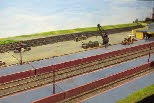
boards made of hardboard - very plain. I had a few match pots in the garage from various domestic projects, which included a Dulux ‘First Dawn’ - a fairly pale blue, more or less as described in the name. I wanted to produce a sky which could be any time of day, or any time of year. The best fit seemed to be a brightish blue (more-or-less neat paint) at the top of the board, gradually diluting the blue, so that more and more of the white ground colour shows through. Plenty of broad horizontal brush strokes gives the impression of high, thin clouds, stretching down to the horizon. The photos left and right show two views of the layout with just this simple treatment, and even this was an improvement on the previous plain white.
Encouraged by a little success for very little effort, I was inspired to start thinking about grass, trees, skylines, etc.
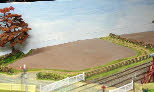
The fields on the layout are currently bare earth (Dulux ‘mocha’ matchpot, plus a bit of ‘stone’ to provide a little shading and variation). The first task was to decide how to blend this onto the backscene, and how to create a sense of depth. I think this can only be judged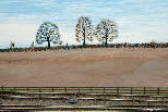 by eye -
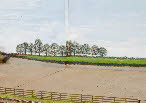
 I’ve ended up painting only a relatively thin strip of bare earth colour above the base-board, but lightening the colour progressively towards the top of this strip. Colours tend to desaturate (ie lose the intensity of their colour in the distance). So lightening the tone gives an impression of distance. The photo (left) shows this, although there is still some work to do to blend the foreground colour to the back-scene. I’ve applied this basic technique to the green fields further in the distance as well, visible on some other panels.
For the detail I’ve turned to artist’s acrylics. They give a very dense colour, and so you can easily paint over any mistakes with more layers of paint on top.
I struggled a bit trying to create a hedge at the end of the bare earth field, until my wife suggested using a stippling technique - a fairly stiff dry brush with very little paint on it, dabbed vertically onto the surface, so that each bristle creates a small dot. Repeating this process (with varying density and colour) along a line gives a very fair impression of a wintery hedge. The height of the hedge gives an idea of its distance from the viewer relative to other higher or lower hedges. The photo above shows a typical length of hedge using this technique.
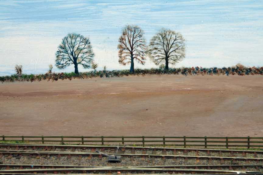
One thing I’m not very good at is colour. I would not, for example, have added blue to brown to produce grey (trees and hedges may look brownish close to, but look rather greyer at a distance). I’ve used brownish colours for nearer trees and hedges, gradually adding blue and white, to desaturate and lighten the colours in the distance.
For the trees I used a slight variation on the hedge treatment. For the nearer trees (also shown in the picture above) which have rather more definition, I painted in a fairly solid trunk and branch structure for each individual tree, and then stippled over this to create the effect of the small twigs, and some autumnal leaf cover. I found a few web-sites which specialise in ‘winter tree recognition’ which show very clear examples of varieties of native British trees and the way in which their branch structures can be differentiated. The photo above of the three trees shows this (hopefully) - the one in the middle is supposed to be an elm, and the other two oaks.
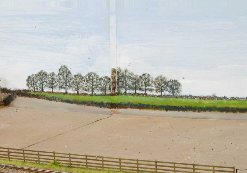
 For the rather more distant trees, I reversed the process, and stippled the outline of the complete stand of trees as a group, before sketching the outlines of the trunks and main branches for each tree: the further away, the less detail. The photo, left, shows this. Not a lot of difference in the final appearance, but a lot quicker to do. As is evident from this photo, there is much more to do to blend the foreground with the background.
None of the above requires much technical understanding of perspective, apart from the basic idea that things get smaller in the distance, and the painterly effect of loss of colour saturation for distant objects. Unless there is a need to place things in the distance at their correct relative distances to each other, then the size of each object just has to look correct by eye.
A backscene for Plumpton Green
Plumpton is a rural village in East Sussex, and around the beginning of the 20C was rather more rural than now, with a population of only around 400 souls, and hence not many buildings. Most of the background (the spectators look northwards) is fairly low-
 My start point was white painted (Dulux emulsion) back-
Encouraged by a little success for very little effort, I was inspired to start thinking about grass, trees, skylines, etc.
The fields on the layout are currently bare earth (Dulux ‘mocha’ matchpot, plus a bit of ‘stone’ to provide a little shading and variation). The first task was to decide how to blend this onto the backscene, and how to create a sense of depth. I think this can only be judged
 by eye -
For the detail I’ve turned to artist’s acrylics. They give a very dense colour, and so you can easily paint over any mistakes with more layers of paint on top.
I struggled a bit trying to create a hedge at the end of the bare earth field, until my wife suggested using a stippling technique -
One thing I’m not very good at is colour. I would not, for example, have added blue to brown to produce grey (trees and hedges may look brownish close to, but look rather greyer at a distance). I’ve used brownish colours for nearer trees and hedges, gradually adding blue and white, to desaturate and lighten the colours in the distance.
For the trees I used a slight variation on the hedge treatment. For the nearer trees (also shown in the picture above) which have rather more definition, I painted in a fairly solid trunk and branch structure for each individual tree, and then stippled over this to create the effect of the small twigs, and some autumnal leaf cover. I found a few web-
 For the rather more distant trees, I reversed the process, and stippled the outline of the complete stand of trees as a group, before sketching the outlines of the trunks and main branches for each tree: the further away, the less detail. The photo, left, shows this. Not a lot of difference in the final appearance, but a lot quicker to do. As is evident from this photo, there is much more to do to blend the foreground with the background.
None of the above requires much technical understanding of perspective, apart from the basic idea that things get smaller in the distance, and the painterly effect of loss of colour saturation for distant objects. Unless there is a need to place things in the distance at their correct relative distances to each other, then the size of each object just has to look correct by eye.